
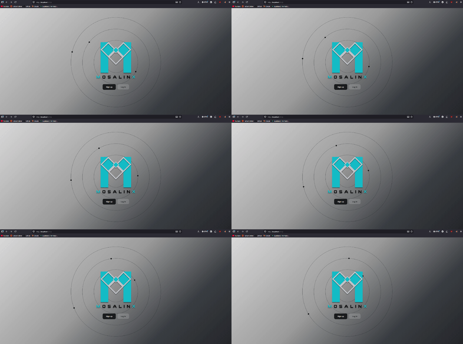
Jumping full fledged into front end development. My goals for this past week was developing the landing page, login page and sign up page. Starting with the landing page, I was inspired by the prototype to do a collection of rings behind the app branding. I had the vision to add these slowly spinning dots on the rings to function like a solar system design. The background is a silvery gradient which is just a stylistic choice inspired by early 2000s aesthetics.
Initial look:
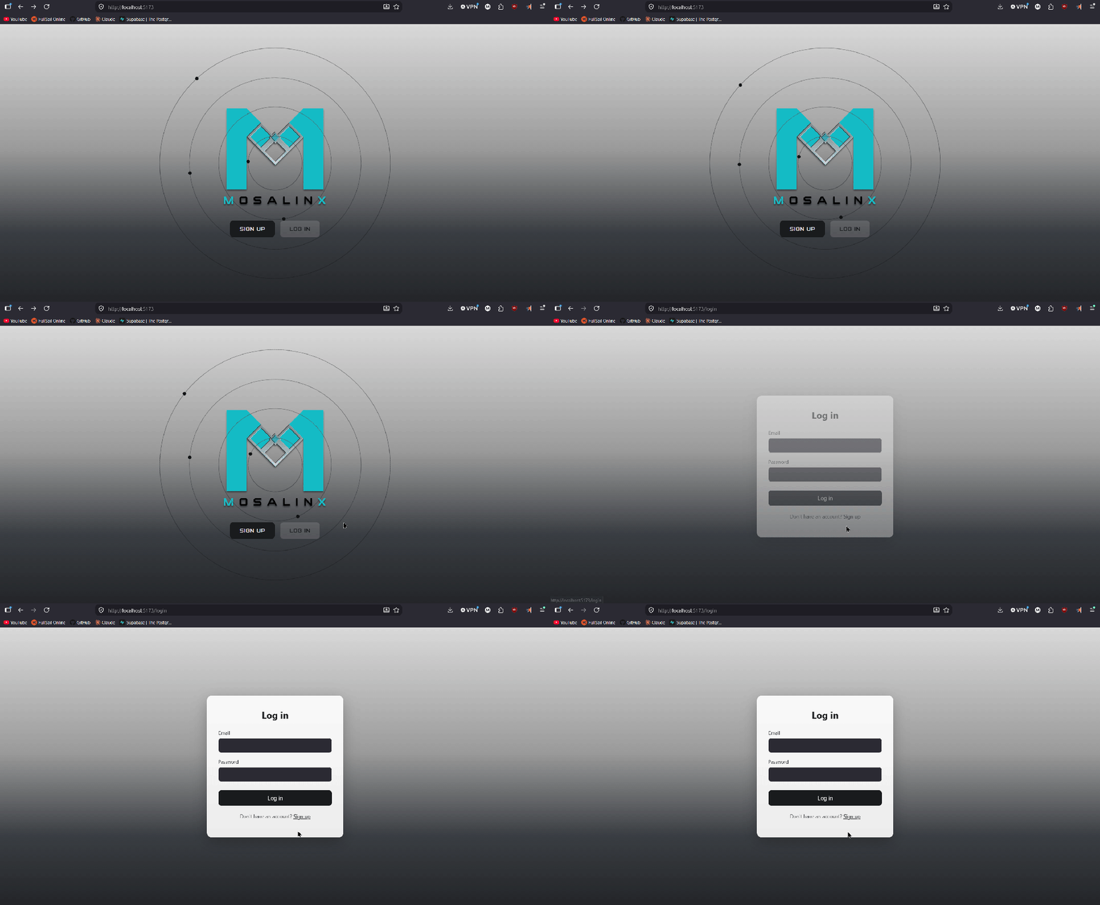
I couldn’t pull the raw logo from our style sheet. So I took to my editing software to design the logo myself. Initially I modified it to something a little more condensed, also tried to focus on the “Heart” design that i feel is relatively central to the design. I made several mockups of other concepts.





We decided to go with the third modification, and I updated the buttons to match the font.

After that was creating the login screen. I had a basic look in mind, so I went with a simple popup window with the relevant fields.
Then came the registration screen. I then had a vision of having the registration fields appear beside the landing screen graphics.
Mockup:
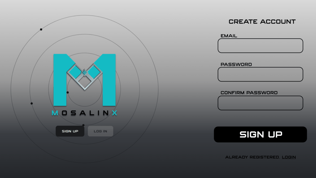
Unfortunately when I researched how I could accomplish this, it wound up requiring adjusting the structure of the code. Specifically by making the graphic a separate asset with its own jsx and css files. I’d have to rebuild the landing page file on top of building the sign up page files as well. Took it to the team and while they agreed it was a neat idea, it was better to keep it simple and consistent with the login page. So I stuck to writing the sign up page to match the login screen. It also simplified the switch function when switching between the login and sign up pages.

With these being set in stone, we will finally start working on the app functionality itself.
 mr-wes.com